If you enjoyed/hated my blog/have money to burn/are crazy, why not give me your money?
All you have to do is click on the button above.
No? Well, go on to the posts below, then, you prick.
Saturday, October 22, 2005
Although the young (but still pretty fucking funny) Darth Sidious said in a previous post that my blog template "seems just about perfect", I have had some gripes about it for some time now. Don't get me wrong, I'm not saying that my tastes are higher than the sprout's or anything snobbish like that. In fact, the lad really reminds me of me, and there is no doubt in my mind that he will probably grow up to become a Dark Lord worthy of all fear and respect from all you other headcounts out there.
Moving on, I really do think the design of my blog template is pretty much perfect. It's black, it's readable, it's simple and it sort of bludgeons its way into the reader's consciousness, doesn't it? That was pretty much what I had in mind when I modified it from its original form. That being the case, my gripes were purely technical ones. Probably not many of you have noticed them before, since most of my readers seem to use IE instead of the totally groovy Firefox. When viewed in IE, the template was perfectly ok. However, when viewing a short post in Firefox, this shit happened.

See, if the post is too short to eclipse the sidebar, whatever part of the sidebar existing below the post gets aligned to the left, which was pretty much of the suck.
Bug #2 was that in my css, all the background is black, while normal text is white. This was pretty much what I had in mind, but hark! When I put tables in my posts, the text in the tables remained normal. Black, in other words, which meant that they were invisible unless highlighted. As an example, look at this.
| this | a |
| is | table |
If you have been reading I Rock, You Suck for some time, you may have noticed that previously, the text in table cells still appeared. That's because I used to manually put in the font colors, overriding the defaults, for each fucking cell. Basically, what I did with the table above, only in reverse. Jesus fucking Christ, that was fucking tedious. For the longest time, I could not be arsed to solve bug #1 because I was too fucking lazy. My reasons for not solving bug #2, however, were slightly more sophisticated. See, I maintain that bug #2 was due to a flaw in HTML/CSS rather than a flaw in my template. Why did tables inherit the background color and not the font color? It's not logically consistent, is it?
Whatever. Anyway, today, I Rock, You Suck proudly announces that it is officially bug-free! Yes, the glorious El Supremo of LEWD has finally gotten off his pert ass and improved on perfection itself. You may all bow down and kiss my toes now.
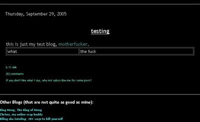
Speaking of that, I was going through my archives looking for tables when I noticed this fucking funny blast from the past. Man, I never cease to be amazed at how funny I can get. Yes, I haven't had much time to blog lately, and most of my recent posts have been announcements. Let's face it, this post hasn't exactly been very humorous either, but hey, go check out the blast from the past instead. Pay particular attention to the table at the bottom. It still cracks me up, and if it's good enough for me, it's definitely good enough for you peons. I will blog more regularly when the exams are over. Toodles.
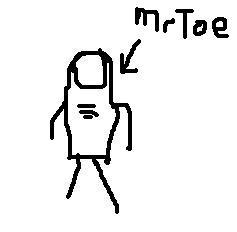
Update: Speaking of toes, my fucking funny friend MrToe has started a blog.

Go check it out if you want to know what he looks like.
Update: The Feisty Bitch has brought to my attention that after the last modification of my template, the sidebar was pushed down in IE. Naturally, my first reaction was to scoff at her choice of browser. Following that, my second reaction was to correct the problem. Now, it works fine in both IE and Firefox, at both 800x600 and 1024x768 resolutions. Higher resolutions, of course, will not have problems. At 800x600, though, some parts disappear into the fucking navbar, for some reason, but then who gives a shit? The important stuff is still shown, and you should really upgrade your monitor if you're still using 800x600 anyway. Ok, ok, that's lazy coding, but I really do not have the leisure to fix it. I think I'd rather redo the template from scratch than fix it, anyway, so I'll just leave it be for now. Anyway, thanks for bringing it to my attention, babe.
Comments:
Back
Exams, exams.
Everyone has exams.
Oh well, I view your blog in
firefox and I've never really encountered those bugs.
Cheers, oh godfather.
After all, imitation is the best
form of flattery. And man, having a younger version of you must be a boost to the ego, eh? Heh..
Everyone has exams.
Oh well, I view your blog in
firefox and I've never really encountered those bugs.
Cheers, oh godfather.
After all, imitation is the best
form of flattery. And man, having a younger version of you must be a boost to the ego, eh? Heh..
i still maintain the pagan bible as one of your great timeless classics. moreover, it always breaks msn ice with female strangers. brilliant!
Post a CommentBack


